C++Builder Tips: which ComboBox to use?
A ComboBox is a combination of a listbox and an edit. C++ Builder provides for three types of combobox styles, that you can select in the Object Inspector.
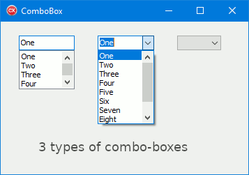
- Simple: an edit control is placed on top of a list box. Users can choose from the list or type text in the edit box. Use this style for short lists.
 If you don't see the items of the list, drag down the bottom border of the box in order to
increase its height (or increase the height in the Object Inspector). If you don't see the items of the list, drag down the bottom border of the box in order to
increase its height (or increase the height in the Object Inspector).
- Drop-down: similar to the simple type, except that the list box isn't displayed until a drop-down button is clicked. To be used for long lists, or if there is not much room on the form.
When the property AutoDropDown is set to true, the combo-box automatically drops down its list when the user starts typing when the combo-box has focus. When AutoDropDown is false, the user must explicitly click the drop-down button to drop down the list.
- Drop-down list: as with the drop-down style, the list isn't visible at first. Users can click the drop-down button and chose from the list, but they can't enter text in the edit portion. Use this type when you want to select only from a fixed set of choices.
To add items to a combobox:
In the Object Inspector, double click the word
(TStrings) next to the property Items.
|
|
